


“How we did something became as important as what we did. If something would be meaningful to even one person in the community — how we sourced an item, a detail we included in a set, a family history we could allude to visually — we had to make it happen.”
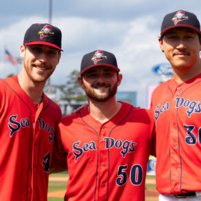
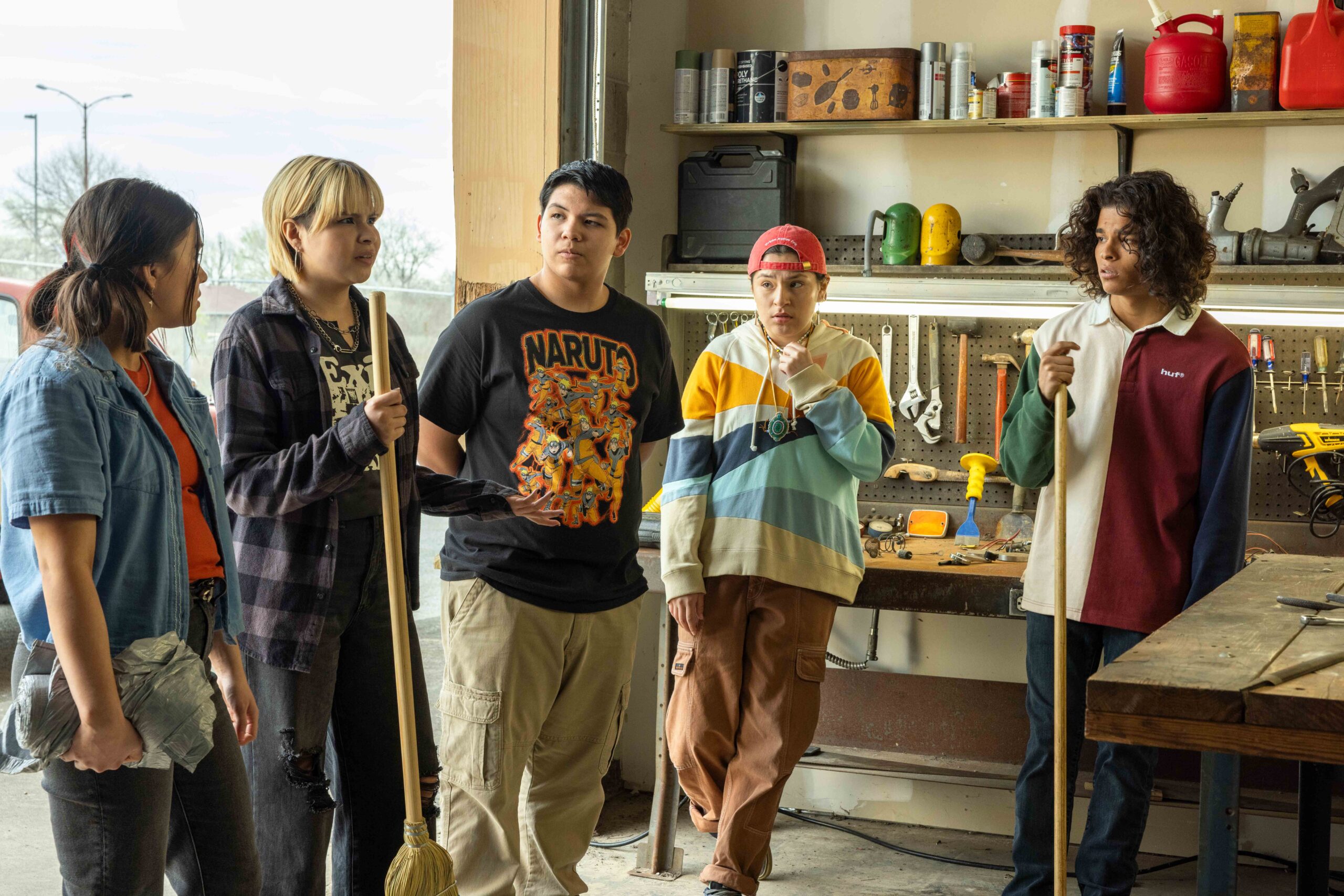
Production designer Brandon Tonner-Connolly faced a unique challenge in his work on FX’s Reservation Dogs. The hilarious and heartwarming series has shed light on the experiences of modern Indigenous communities since it first premiered in 2021, but S3E3 “Deer Lady” offered an unsettling look back at the abusive boarding school environments of the 19th century and 20th century. Tonner-Connolly knew he had a unique responsibility to stay both faithful and respectful towards the memories and experiences of the Indigenous community in the United States. That responsibility extended not only to viewers, but to the very members of the community on set with the accomplished production designer each and everyday.
“When we were designing and decorating the sets, we were thinking about what the camera would see, but we were equally if not more so, thinking about the people who would be in the room,” says Tonner-Connolly. “We were thinking about the crew who were from the community, the cast who was from the community, and the people down the block who might stop by to watch us filming. We wanted them to feel the spaces were right and to be positively affected by the choices we were making.”
With such a sensitive and creative perspective in place, Tonner-Connolly managed to put together some of his career’s most incredible work, even winning an Art Directors Guild Award for his work on “Deer Lady.” He had just been nominated for the award the last time he spoke with Awards Radar, and views his victory as a testament to his entire team’s talent and camaraderie.
“I see the ADG award as an acknowledgment of everyone in the Art Department’s belief in the power of storytelling, and I’m very grateful for it,” says Tonner-Connolly.
Check out our full conversation with Brandon Tonner-Connolly below. We discuss the research that went into his work on “Deer Lady,” and even compare his work on Reservation Dogs to his recent design work on Jane Schoenbrun’s brilliant I Saw The TV Glow.
Brandon, congratulations on winning the ADG Award! The last time you spoke with Awards Radar, you were just nominated. How does it feel to have won for your work on season three?
I’m still overwhelmed by gratitude. For me, the award is an acknowledgment of the hard work and dedication of everyone in the Art Department (and on the entire show.) I may have mentioned this the last time, but a week before we were supposed to start loading in the sets for the boarding school in “Deer Lady” (the episode the ADG Award singled out for an award), there was a catastrophic fire in the building that housed our construction, scenic, and set dec shops. The building’s structure was almost destroyed in the blaze, which meant much of the historical dressing was gone before it could even reach the set, not to mention dozens of kits and personal tools that were lost in the middle of production. Things that hadn’t been burned were soaked by water from the firehoses.
Thankfully, no one was hurt, but it was quite devastating, both logistically and emotionally. I think a lot of different crews would have accepted it as a major setback and compromised the work, but our Art Dept never skipped a beat. We had a big team meeting, we all listened to how everyone was feeling, and we made the decision to move forward to do our best work without looking back. We succeeded, and production continued without a costly change in schedule (no small matter for a show like ours), which was a testament to the sense of responsibility everyone felt toward the story and the series in general. Everyone knew the story we were telling was too important not to tell and not tell in rich visual detail to communicate the full extent of the horrors of that history.
I see the ADG award as an acknowledgment of everyone in the Art Department’s belief in the power of storytelling, and I’m very grateful for it.
You recently served as the production designer on the hit film I Saw the TV Glow. How did designing the spaces for that film differ from designing the spaces for Reservation Dogs?
Even though the two projects are obviously very different design-wise, I still try to approach them from the same starting point, through the characters and the decisions I think they would make based on the script and conversations with the director. Whether it’s a more stylized world like I Saw The TV Glow or a more naturalistic world like Reservation Dogs, it all needs to feel like it’s grounded in the characters and the character details. In either case, I’m starting from thinking through how they would create their spaces and moving on from there.
How did you and the Location Manager, Chris Kucharski, settle on Bacone College for the 1940s boarding school in episode three, “Deer Lady?” What made it different from the other locations you looked at?
Bacone College offered us the architecture we needed for the bones of the spaces we were creating while also providing the best logistical situation for us. Despite the unique subject matter and the delicacy with which we all wanted to approach it, we still had a standard TV timetable to turn around our work and two days to shoot it all. The layout at Bacone allowed us to move quickly from building to building and set to set during the shooting day, which was crucial.
Beyond that, Bacone has a rich history in the Indigenous arts community of Oklahoma and it felt appropriate to put money from the show back into the community in the form of location fees and other resources.
Reservation Dogs was one of the first shows to discuss the tragedies that unfolded in the 1940s boarding schools. How much pressure was there to accurately depict the history?
I tried to think of it less as pressure and more as an opportunity to tell a story that needed to be told (but that didn’t actually make it less anxiety-inducing.) We felt such a massive weight of responsibility to get it right and to be historically accurate because we wanted to help convey what the awful, dehumanizing experience was like.
So we started with vast amounts of research. I got into the process weeks before we even started officially prepping. We looked at every photo we could get our hands on from every boarding school from the late 19th century to the mid-20th. We took a trip out to the historical archives in Anadarko, OK, to meet with people there and gather images. Tafv Sampson, the show’s Set Decorator, contacted Denise Lajimodiere, the author of Stringing Rosaries, a history of Plains Boarding Schools, and Denise came on board as our consultant, answering our many, many questions on everything from plates and spoons to bedding and desks. When we asked Denise about corporal punishment or depicting other types of abuse, she told us, “Whatever you show onscreen will not be as bad as it was in real life.” We had to be mindful of the emotional toll all of this took on everyone in the Art Dept, some of whom had family members who had been in similar institutions.
I think we felt a general sense of pressure for all the sets, though, boarding school and beyond, because we knew we had to create authentic spaces for the people who would be experiencing them through their work on the show. When we were designing and decorating the sets, we were thinking about what the camera would see, but we were equally if not more so, thinking about the people who would be in the room. We were thinking about the crew who were from the community, the cast who was from the community, and the people down the block who might stop by to watch us filming. We wanted them to feel the spaces were right and to be positively affected by the choices we were making. It was about that experience as much as the people at home.
And because of that, how we did something became as important as what we did. If something would be meaningful to even one person in the community — how we sourced an item, a detail we included in a set, a family history we could allude to visually — we had to make it happen. The idea pushed us to create an even more fully realized, authentic world because we felt a responsibility to make environments that resonated first and foremost with the people who were trusting us to help tell their stories.
Can you discuss the process of sourcing and designing the dormitory, including the use of period-accurate items and antique beds, and how it contributed to the authentic portrayal of the 1940s boarding school?
It definitely all started with the research I spoke about earlier. I feel like references are the foundation of any set, the base you’re building all your other efforts on top of, but that was especially the case with the boarding school spaces.
For the dormitory, we knew we wanted to have a sense of symmetry in the layout of the space and that we wanted to create almost a vanishing point at the end of our rows of beds. I also knew I wanted to have a central symbol/structure to anchor the space and call attention to how regimented the environments are. In the dorm, that became our cross on the wall above the door, where as in the mess hall that became the stone fireplace.
Danis Goulet, the director, came in with amazing visual ideas, including giving the episode a very 70’s horror aesthetic with long lenses and a palpable sense of dread. We talked about Luca Guadanigno’s Suspiria and a few other films as color palette references. Establishing a color palette was important because all of the research was in black and white, and we wanted to make sure we were really giving the episode its own identity. I think the genre aesthetic was a nice way of making the incredibly weighty subject matter a little more digestible, so it felt a little more fantastical or like a dream than a gritty doc, and it also set this episode aside in its own very separate universe.
Keeping that in mind, we picked elements from the references we thought were important to the space, like a hardwood floor with a style of the period and a very high gloss, so it kicked back some moonlight during the night scenes and added to the mythical aesthetic. I also wanted to add wood panelling to the walls to give everything a deep, dark feeling. And we wanted to incorporate small details wherever we could, like small decorative crosses on our plinth blocks that edge out the wood panelling to keep the symbols of power and oppression everpresent. Our Art Director, Matt Hyland, was a real hero, and we had an amazing Construction/Scenic team led by Aaron Maier, our Construction Coordinator. They were able to build and install the flooring, panelling, and a million other details in this very large space under very challenging circumstances.
As far as the Set Dec aspects, Tafv Sampson did an incredible job of sourcing authentic, meaningful dressing. Our beds were actually taken from a former boarding school. Normally, our sets are so layered, lived-in, and character-driven on the show, but this was an exercise in keeping it very austere.
How do you divide responsibilities between you and your team?
I like to talk over the references and the important design points with each of the department heads (the Set Decorator, the Art Director, and the Prop Master) and then let them have the freedom to come up with ideas that inspire them. I also obviously let everyone have their space, but I do like to think of the Art Department in general as a team and an organism that sinks or swims together. I think part of being a leader and a department head is putting people in the best position to succeed and use their strengths, which I try to keep in mind when I’m putting together a team and when we’re in the thick of it creating a world together.
This post was originally published on this site be sure to check out more of their content.