Drew and Jonathan Scott are back with a new HGTV show: “Don’t Hate Your House With the Property Brothers.” And in the premiere episode, it seems the brothers’ designs have already gone to the dogs, so to speak.
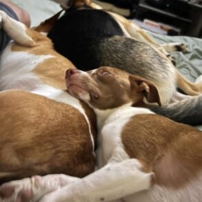
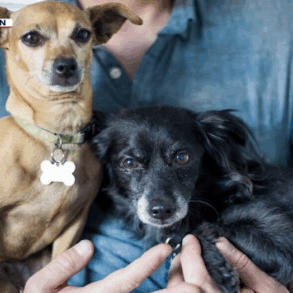
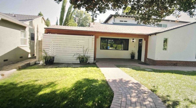
In the episode “Canine Conundrum,” Drew and Jonathan meet with Johnny and Jackie, proud parents of one 7-year-old son and five adorable rescue pups. They love their North Hollywood, CA, home, but it is too cramped and dysfunctional for this family of eight.
The couple ask the brothers for an updated design, a functional floor plan, plus some special features to make their dogs happy.
At first, Jonathan seems to understand the desire to add special features for the pups.
“A lot of the decisions about what I need in a home are based off of what my dogs need,” says Jonathan, a self-described “dog dad.” However, the HGTV stars later hint that the canine-focused requests have gotten out of hand.
“I’ve never had a house with so many requests specifically for the dogs,” Drew says.
“There are more requests for the dogs than the humans,” Jonathan adds.
Is this $230,000 renovation too focused on Fido? Read on to see this dog-friendly design, plus get “Property Brother”–approved tips for making life easier with your furry friends.
First things first: Protect your renovation from rain
(HGTV)
Jackie and Johnny are excited to upgrade their home from the beginning, but the brothers know that renovation isn’t just about looks. When Jonathan finds water damage in the kitchen, he knows the team must fix the roof to ensure no more water comes in.
It’s a big job with a hefty price tag, but the brothers know that repairing the roof is essential.
“I’ve heard so many people who said they did a renovation, but they cheaped out and didn’t redo their roof when they needed to, and sure enough, it was ruined,” Jonathan says.
It’s a good reminder that function and appearance are important in a home, but safety and security are even more important.
Design the kitchen layout with care


(HGTV)
One of the biggest problems with this house design is the kitchen. It’s dark and closed off, with no prep space.
Jackie and Johnny admit that the cramped space has caused arguments. They even avoid inviting friends over because they’re embarrassed about the ugly kitchen.
Jonathan agrees this kitchen is bad, calling it “utterly useless.”
The team gets to work breaking down the kitchen wall, gutting the space, and creating a new kitchen that’s both beautiful and functional.


(HGTV)
But Jonathan and Drew know they can’t forget about the dogs. After all, part of the function issues came from trying to feed this large family.
So they add a water dish station, with a handy pot filler, to the side of the island. They also install multiple feeding dishes throughout the kitchen that pop out of the kick plates.
Of course, finding the right spots for these feeding dishes proves to be a challenge. The brothers don’t want to put them anywhere that would be easy to trip over or could cause kitchen congestion.
“When you’re going to all this work to custom-design something for the dogs and the humans, you have to think of all the potential pitfalls,” Jonathan says. “Don’t put a drawer in a place where you’re going to be using the sink, don’t put anything in a place that’s going to gramp everybody’s flow. There’s a lot of extra thought that needs to go into this one.”
Eventually, they find the ideal placements, and Jackie and Johnny are thrilled. It’s a new kitchen with a much better function for this dog-loving family.


(HGTV)
Don’t block sightlines with a hood vent


(HGTV)
With such a big, open kitchen, the brothers wouldn’t want to block sightlines with a giant hood vent. So the team installs a down draft next to the range; it rises from the island with the push of a button.
“By doing a down draft, you all of a sudden don’t have anything obstructing your view, so it keeps it feeling nice and open,” Jonathan says. It’s a clever addition to keep this kitchen flowing.
Replace an unwanted fireplace


(HGTV)
When Drew and Jonathan first tour Johnny and Jackie’s home, Johnny says he’d like to remove their fireplace. Being in sunny Southern California, they never use the feature, he explains.
Jonathan suggests removing the stone and installing a 6-foot sliding door that will give them (and their dogs) direct access to the yard and allow lots of natural light to enter the space.


(HGTV)
Of course, this door makes a huge difference to the home. With the new open layout, the entire living space benefits from the flood of sunlight from this door. Plus, the easy access to the yard will undoubtedly make it easier to be a dog owner.


(HGTV)
During his initial tour, Jonathan is surprised to find a “huge” laundry room in this cramped house. The space is clearly underused, and Jackie says she’d love to put a dog wash station in it.
“That totally makes sense,” Jonathan says. “If you have five dogs, you need a place to groom them.”
The team reconfigures the laundry room, adding a new stacked washer and dryer, a folding station, and a dog wash. While Jonathan originally planned to have a step to keep the water in the doggy area, he decides to make the whole thing flat with the rest of the floor, creating a sort of wet room.
Jonathan explains: “I was actually a little worried about having the curb there because if, and when, they’re using this for laundry, you could kind of step back and trip over the curb and go for a tumble. So I feel like, aesthetically, this looks better, and it’s also going to be safer.”
Of course, Jackie and Johnny love the finished product—and all the money they’ll save at the groomers!
This post was originally published on this site be sure to check out more of their content.
